Template-driven optimisations: Consolidating and animating the confirmation page
Objective
The goal for this experiment was to observe if optimizing the template funnel by consolidating and animating the confirmation page would increase expansions and signups for Jira Service Management.
—
ℹ️ What is Jira Service Management you might be asking? It’s a tool that helps companies manage and respond to customer and internal requests more efficiently.
Company: Atlassian
Role: Growth designer
Work: User Research, Visual/User Interface and Experiment Design
Team: Cross-functional Stakeholders, Content Designer, Product Manager, Engineering
Impact
In 4 weeks we achieved:
~8% uplift in D1-6AI and + ~10%^ uplift in signups (expand rate)
Next steps were to hand these over to the product team and extend this experience to other templates funnels.
Problem
Prior to this experiment, we were communicating the value of a product using abstract illustrations and mountains of text. We were only telling the user how it worked, not showing them.
Moreover, the template funnel consisted of numerous steps before landing in the product. Our data told us that:
🛑 40% of people who view a service management template detail page don’t progress
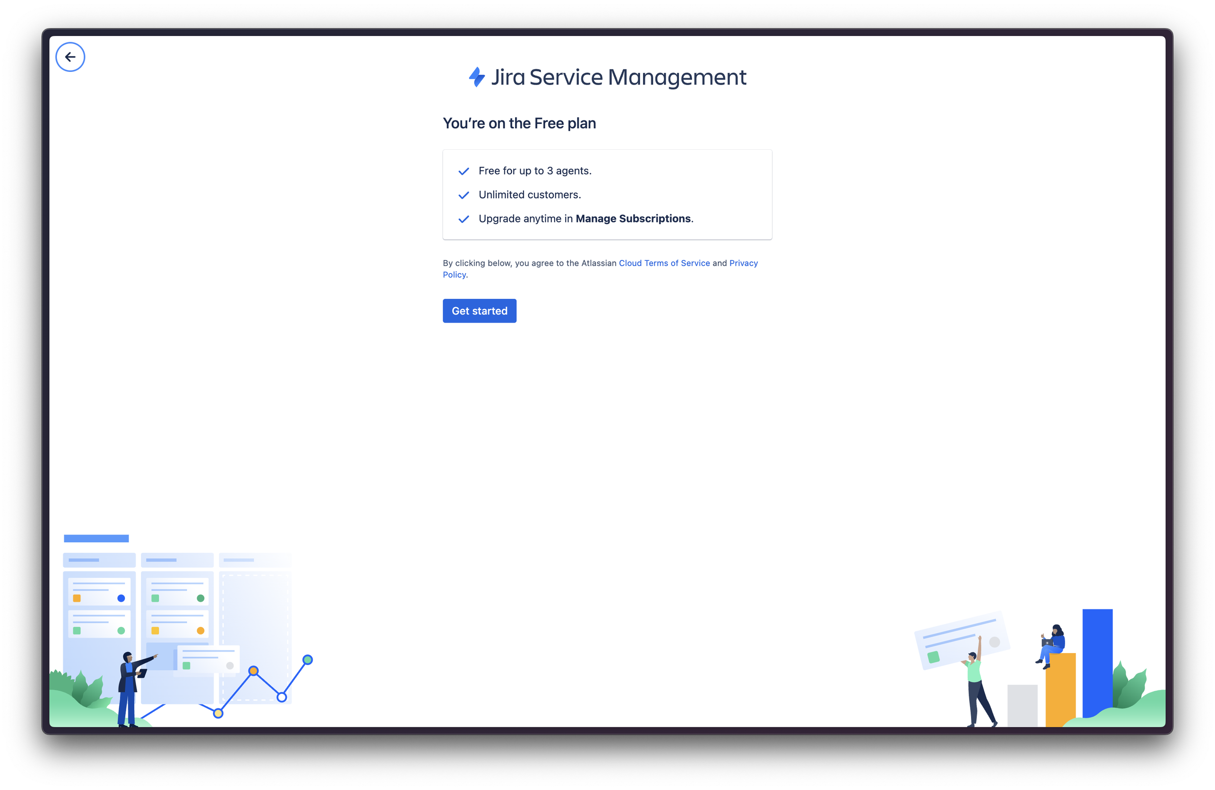
🛑 30% drop off at the plan confirmation screen
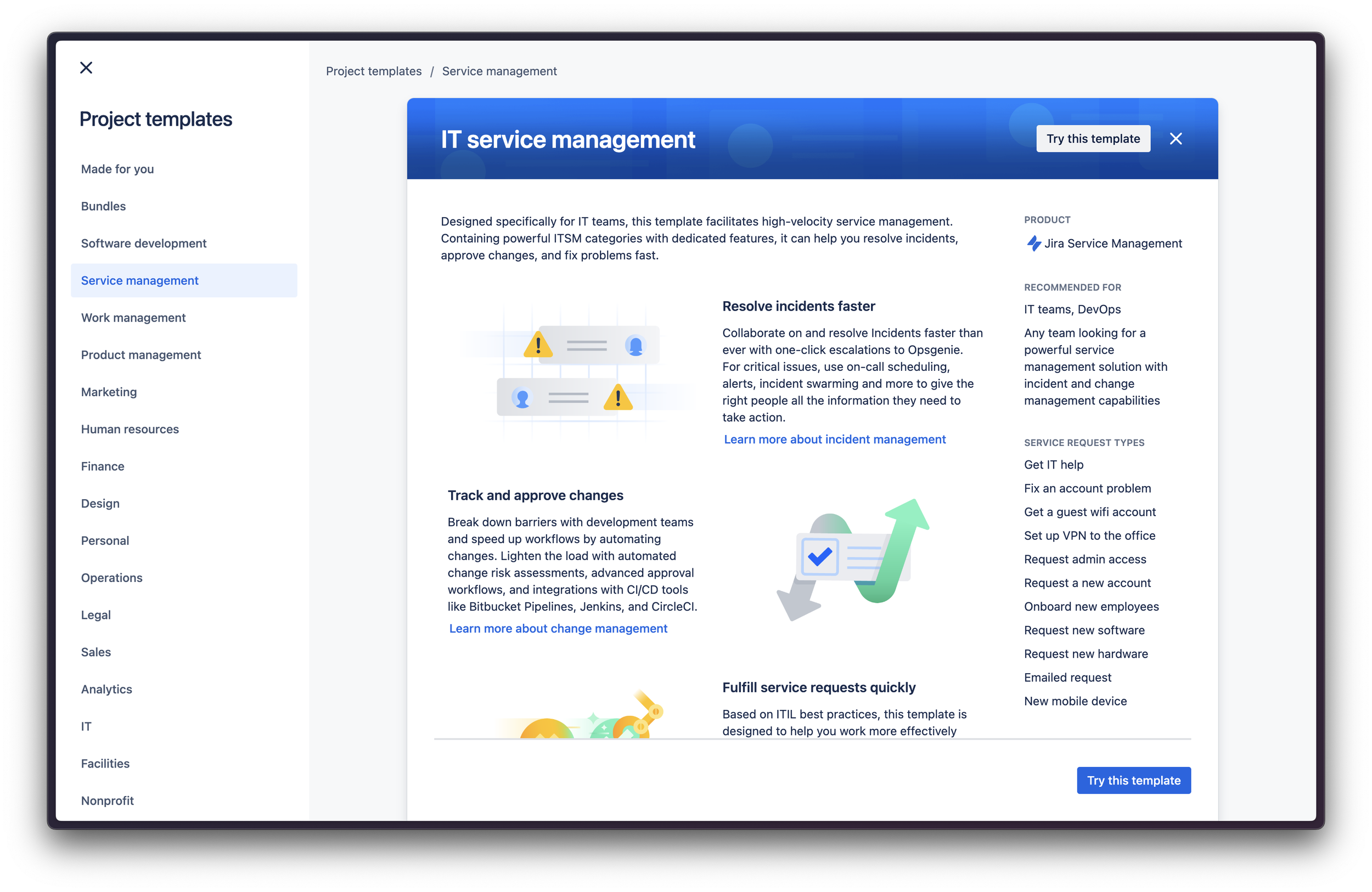
Template detail page
Plan confirmation screen
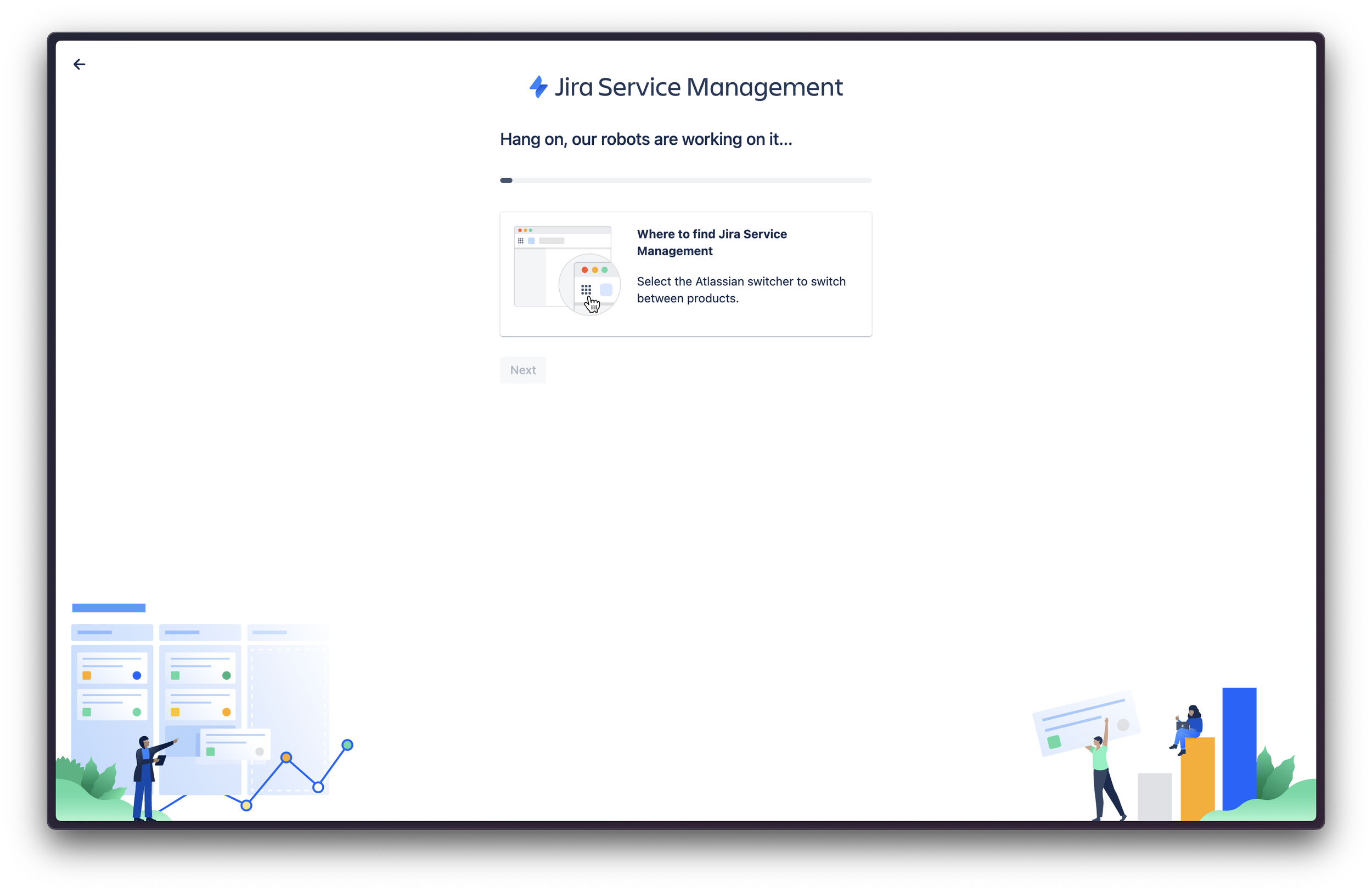
Provisioning
Opportunity
How might we… communicate key features of a template and make it easier for teams to ascertain if it is fit for their needs?
Hypothesis
If we… consolidate and animate the template funnel for users that are cross-flowing from Jira Software, then… we’ll see an increase in Jira Service Management usage because… it will be a more simplified journey that makes it easier to digest how it works.
Insight
💡Admins struggle to keep track of requests especially when they’re coming from multiple channels, simultaneously.
Design jams
I kicked off the exploration phase by facilitating a design jam with my growth team. We each ideated what key features we thought were important to convey in a short animation.
After some riffing (one of my favourite parts of designing), the general consensus was that showing where requests come from and how they’re resolved is a driving value proposition. This aligned with existing research and insights.
Rapid animation exploration
Because this was an experiment I didn’t want to overcook it using a tool like After Effects. So the idea was to use Figma’s smart animate feature and “prototype” the animation. Below is a lo-fi draft of 1 of 2 narratives.
Going broad with concepts
Using gifs I found online, I wanted to explore concepts that included display controls. However, since this was an experiment to learn the efficacy of better visuals we decided not to add another variable to the experiment. Below is of many concepts.

Experiment design
The decision was to test the experiment design on two templates: IT service management & General service management.
We used a fullscreen modal component to house our consolidated experience and combined the template detail page, plan confirmation and provisioning screen. This optimisation made it feel much quicker to get started.
IT service management
General service management
What I learnt
Further learnings and reflection taught us that we need to look down the funnel and identify ways we can improve the product-landing and onboarding experience.
JSM is a complex product. To reduce churn, improve D1-6AI and increase MAU, the time-to-value or “AHA” moment needed to be much sooner and easier to experience.


