Understanding our shopper’s product evaluation journey & jobs-to-be-done
We know majority of the time shopping for furniture isn’t a compulsive action. It requires research, joint decisions, spatial awareness and other factors to ensure the right investment is made.
With vision to create a seamless experience for our users - Product & Design set out to conduct a study to inform upcoming cycles.
Company: Brosa
Role: Product Designer
Work: UX Research
Outcome
We used this user research to drive the following cycle - Improving Conversion and Engagement on the Product Detail Page which saw positive business impact (+5.33% CVR).
Process Overview
Objective
The goal for this study was to observe shoppers in mid-funnel tasks and understand how our product detail page performs relative to customer needs.
What tasks (mental, physical) do shoppers perform?
What information and experiences are most helpful?
Key Deliverables
Insights - Distilled information to drive product design.
Framework - A holistic view of our shoppers journey.
Research Report - A summary of insights and outputs to share across organisation.
Strategic Direction and UXR Planning
Over the years, features shipped onto the product detail page did not adhere to design principles or UX best practices - resulting in a convoluted experience with key information scattered or buried within the page.
Given the entry points, traffic and information on the PDP - it made sense to begin our research here.
We wanted to observe core interactions, understand what information is meaningful and learn how they navigate our PDP. To achieve these goals, we needed to put our participants through a series of activities for us to understand their evaluation journey deeper.
Quantitative - Breadth of the problem (N is hidden for privacy)
Qualitative - Depth of the problem
Finding the right Participants
According to a recent marketing survey, 81% of respondents were female with over 71% having visited the website. 30% were between 25 to 34 years old, followed closely by 29% aged between 35 to 44 years old.
These stats gave us enough confidence to recruit female participants within those age brackets.
We designed a flyer to leave in-store and asked our lovely studio stylists to help find us leads.
Our Participants
Natasha, 25, Dietitian
Tracey, 28, Radiographer
Laura, 33, Events Director
Amanda, 33, Interior Designer
Tania, 42, Financial Project Manager
Interactive Activities
During the activities, each participant demonstrated their thought process and shared what information is meaningful to them. This allowed us to observe their behaviour, but also give them a moment to reflect on their own tendencies.
We asked them to perform x3 activities:
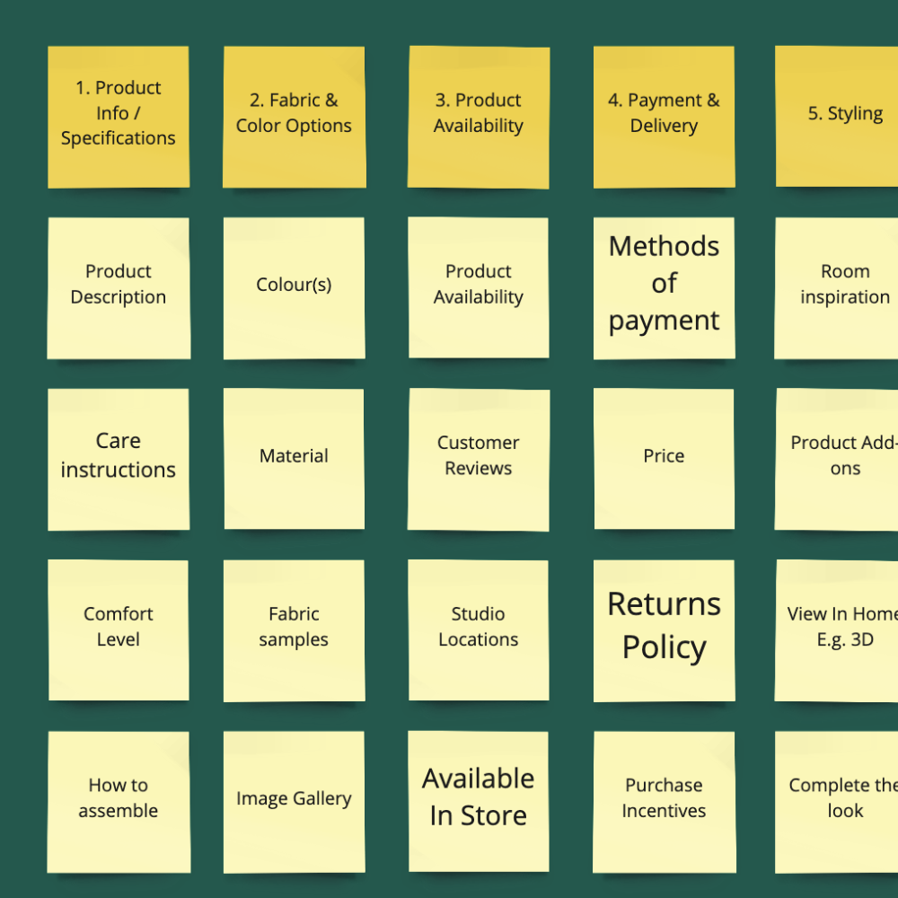
Concept Listing
Open Card Sorting
Usability Test
Concept Listing (Miro) - List types of information meaningful to them.
Open Card Sorting (Miro) - Sort, define and rank information by importance.
Usability Test (Web) - Perform a task i.e “Find a dining chair you like and buy it”
Synthesis
During usability testing, it was evident that the core interaction of the product detail page was “image review”.
Image review leads consideration. The image carousel was the key component our participants used to match with their personal style. When a product didn’t resonate, majority of the time abrupt abandonment occurred and browsing would resume.
We noticed 3 to 5 key attributes are sought when there is interest in a product. Participants expressed that in certain instances, one attribute can really drive consideration such as dimensions, materials, availability etc.
This insight validated the need to revisit the information architecture of our product detail page. Today information is scattered across the page, resulting in shoppers feeling disoriented from scrolling up and down.
6 Key Insights
Shopper Task Framework v1
With new found knowledge, we further synthesised our data into a what we call a “Shopper Task Framework v1”. In this exercise we found two high-level activities, “Discover & Compare” and “Understand & Decide”. Within these are five phases our shoppers may need to experience to guide them to the right product.
Consider, Filter, Evaluate, Review and lastly Purchase all have specific questions that need to be answered before proceeding to the next. These internal questions progressively validate the value and worth of a product to each shopper.
During this journey, we observed two different types of behaviour. A quick/gut reaction is the first instinct during the Discovery & Compare stage, while a deeper and more methodical process is actioned during Understand & Decide. These behaviours displayed an importance of the systematic approach our shoppers take to confidently search, browse and find products.
Reflection
Feedback was positive and peaked some individual contributors interest, asking to be invited to spectate in the next round of research. It was vital that the output would be digestible for all levels of understanding to passively advocate human centred design thinking.


